Dear Clients, dear Partners:
First of all, Thank you for your continued support! For the purpose of upgrading the image of our company, building our brand, improving our brand influence and competitiveness, we made some alteration on the original logo.
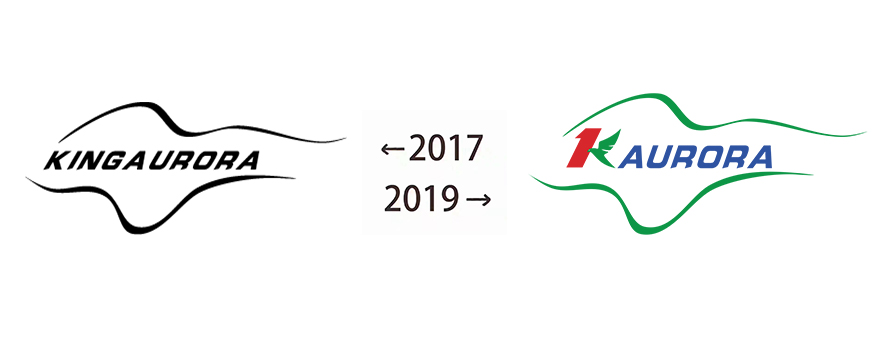
The new company logo will be put into formal use on 1st,Dec, 2019.Meanwhile, the original logo stop using.
The design philosophy of our new logo are as follows:
1. Our new logo “K Aurora” is simplified from the original “KingAurora”. The transliteration of simplified logo is “k-aurora”, full name is “The King of Aurora”, Chinese name is “极光王”.
2. The first half part of K is Arabic number “1”, it represents our development goal: To be the No. 1 of LED display industry in outdoor fixed DIP area..
The second half part of K is like the Aurora as well as a soaring eagle. It signifies our company become more and more powerful.
3. Color configuration: “1” uses red color. It represents our company is full of development vigor. The eagle and two waves are green color of the Aurora. It represents our company has peaceful development environment , amicable social interface and is full of infinite hope. The color of “Aurora” is deep blue,which represents our company has farsighted development view as well as steady and open-minded operation style.
From now on, new logo will be used on all occasion that it appears, such as our company website, business card of employees, propagandist materials etc. The original logo is of equal effectiveness as the new one. And sorry for inconvenience caused. Thank you!
3th Building,Gaosite Zone Pingshan
New District, Shenzhen


sevice88@kingaurora.com
3th Building,Gaosite Zone Pingshan
New District, Shenzhen